
Were you ever browsing a website and came across a button that you couldn’t resist clicking?
Whether you notice it or not, Internet users have more than once been spellbound with the magic of a call to action. Appearing in the form of a button, a call to action does the quintessential task of attracting the user toward clicking it. It makes people wonder, what will happen if they click this button.
In other words, a call to action button generates anticipation in the user about the product and services of a company. It is a way for organizations to get to the potential leads and convert them into loyal customers.
Call to action buttons are one of the most important elements on a landing page or website. Gone are those days when marketers went from door to door to sell their products.
But, with a call to action button, traditional marketing just found an upgrade with the same underlying motto. Every customer that clicks on the CTA is a potential customer walking past your door.
As a marketer, you might spend a lot of time designing a landing page. You think about the colours you will use on the landing page, the theme of your website, the right balance of the graphics and content, headlines among other things.
However, marketers often skip forming a strategy around the call to action. Not only can be it one of the biggest business-critical mistakes but also be the difference between a conversion and a bounce.
Even though leaving your CTA button as ‘submit’ might seem the easiest thing to do, you shouldn’t go for it. So, what does an ideal CTA look like? And why is it so important for a business?
If you’re looking for answers to these questions, don’t worry. We’ve got you covered.
Let’s take a look at how CTAs can cause all the difference to your business.
What is CTR?
You might have heard about CTR as you run a website on the Internet. After all, it is a popular online metric that is in many ways responsible for the success or failure of your business.
The point is that search engines place a huge bet on good click through rates. Put differently, in a pay per click model, the more someone clicks, the more money a search engine earns.
The same scenario applies to websites. Click through rates are a percentage of impressions that resulted in a click.
Whether you’re a blogger or a startup, marketing agency or a well-established enterprise. Everybody wants more clicks that lead to lead generation.
The question is how to get more clicks?
Hint: You already know the answer!
A powerful call to action button can help increase the click-through rate on your website. For this reason, if you’re missing out on writing some amazing content for your CTA, you’re missing out on some real business. Put differently, the impact of a call to action can be directly measured through the CTR.
Therefore, as a metric CTR tells you how good is the traffic coming to your website. A high CTR rate means that users are finding your business interesting. On the other hand, a low CTR would mean you are being visited by users who are not relevant to your business.
All this makes CTAs even more important for your website. They are an integral part of the online subscriptions, opt-in forms, surveys among others. Their primary goal is to entice the user to click on them and move forward.
Conversely, the clickability or click-through rate determines the quality of your call to action.
Why is CTR so Important?
Believe it or not, your click-through rate is an important metric for your business. It is a direct telltale of the success of your marketing campaigns.
No matter how much effort you’re putting in building a fantastic website, landing page or a marketing campaign. Unless it’s returning you a high CTR, you aren’t sending your message across clearly.
Upon calculating the number of people who click on your call to action button vs those who visit your website, you can calculate the strength or weakness of your CTA’s content.
A lot of elements can matter when it comes to getting a high CTR rate. Some of these include the copy of your CTA, imagery, positioning, keywords you target among others.
Another reason why CTR is important for your business is because it helps you increase conversions and ultimately generate more sales.
As a business, it is always one of your primary goals to get more customers. It not just directly impacts the growth of your business but also the revenue you are targeting.
When it comes to a landing page, CTR is a metric that directly acts as its quality score. Most businesses often focus on conversions but forget the importance of CTR in the process.
However, as much as conversions matter, so do the increasing click-through rates since it is attributed to the number of people who can convert.
In other words, if you can get your CTR to increase, conversions will follow. For this reason as a business, it is important that you keep a close eye on this metric.
To figure out whether you’re doing a good job with your landing page or marketing campaigns, it is best to compare your CTRs with the industry averages. For example, the average B2B CTR for the channel email is 2.59.
To find out your CTR, all you need to do is divide the number of total impressions by the total number of clicks and multiply the score by 100. For example, if a new landing page on your website generated 100 clicks and 8000 impressions, your CTR is 0.8%
15 CTA to Increase CTR
Now that we know how CTR can have a direct impact on your business, let’s take a look at 15 CTA examples with the power to increase CTRs.
1. SocialPilot: Start Your Free Trial, Check Our Plans

SocialPilot is an amazing social media engagement and scheduling tool that is used by several organizations. The company aces engagement not just on social media but also on its website.
If you closely look at their homepage you will find two perfectly places call to action buttons. There is also a third one at the top right corner of the screen.
What’s amazing about their CTAs is that they are using the entire space of the screen efficiently. This way they are not letting go of the visitor’s attention from anywhere on the screen. The point is that they could have placed one button, but they did two.
While one reads ‘Start your free trial’ the other one asks the user to check out their plans. Obviously, any new user would first check out the company’s plans and then prefer signing up. The second CTA, therefore, increases the click-through rate, thus driving more conversions.
The buttons, therefore, fulfil most of the visitor’s queries. Those who would want to signup and get started with the services can do so with one click, while those who would like to check out the plans can click on the other CTA.
Another thing to note about the CTAs is their colour. While the bright colour attracts attention instantly, the white one becomes noticeable when one is just looking around the page.
From this example, one thing to takeaway is that multiple calls to actions can be genuinely helpful in increasing the CTR when used correctly.
2. Shopify: Start Free Trial

Shopify is a titan when it comes to helping users build an online store. The best is that it lets them do it without any prior knowledge of coding or designing. There’s yet another thing that Shopify masters perfectly. It’s their wonderfully placed CTA on the homepage of their website.
They have two calls to action on their homepage, one above the fold of the screen and the other at the menu bar. Both of these are perfectly placed in the areas with visitor’s maximum attention.
Shopify’s aces its CTAs not just in terms of placement but also in terms of their colour and content. They are vividly visible on the screen with a clear message.
When users come to their website, they know the company helps them build online stores. All that’s remaining to do is give a trial, which is what its CTA displays.
The green colour is visually appealing and grabs attention instantly. What we can learn from this example is that a striking colour and a simple message can make all the difference to your landing page.
It offers the user something for free, ultimately generating the potential for high CTRs.
3. Mailchimp: Pick a Plan

If you’ve ever tried email marketing, you couldn’t have gone without hearing MailChimp’s name.
Mailchimp is one of the pioneers in email marketing helping brands reach out to a large number of customers through emails.
When it comes to their call to action button, Mailchimp aces it with simplicity. They have a single CTA on their website that says ‘Pick a Plan’. With this he company lets users sign up to their free plans and send away a limited number of emails.
However, with a yellow background, their robin blue coloured CTA is quite distinguishable. What makes it more appealing is their simple text.
But, there’s definitely room for improvement since they could have done a lot more with its placement, size, colour.
For example, using words like ‘email marketing’ on their CTA would have caught more attention from the user and increased the CTR to an extent.
4. Neuraltext – Try for FREE. No CC Required

Neuraltext is an AI powered tool for content creators. AI copywriting, content optimization and keyword clustering are their prime features.
This tool can help you to write awesome copy for your articles with the help of GPT-3 technology.
“Try for Free. No CC required” is a no-brainer call to action. When we see the word “No CC required” we get ready to take the action and try that service.
5. Artlist: Start Free Now, Pricing

In another example of twin CTA buttons, we find the website Artlist. Artlist is a music subscription service that provides background music to video producers, vloggers, YouTubers among others.
Artlist chose to have two CTA buttons placed adjacent to each other in different colours. While one entices the audience to check out their services right now, the other one lets them know the pricing.
Having two CTAs certainly increases the chances of high CTRs and more conversions. Artlist’s CTAs are distinct in colour as compared to their background and provides more opportunities for visitors to convert.
6. Shinesty: Get $10 for Free

Shinesty has probably one of the craziest CTAs you’ll find out there. Being an apparel brand, it ditches mundane calls to actions like ‘Shop Now’, ‘Add to Cart’ etc. Instead, it asks its users to sign up and subscribe to their emails with an attractive and quirky CTA.
The best part is that the CTA is unique in colour and not at all boring. It certainly increases the chances of CTRs and is something that visitors might want to try.
7. Crazzyegg: Show Me My Heatmap

Crazyegg is a tool that lets marketers improve their website by understanding what works, fix what isn’t present and test new ideas. It has one of those kind CTA that makes it distinguishable from all other brands out there.
It has one clear CTA that entices a visitor because it gives them something valuable. Marketers who check out Crazyegg are already looking for a solution and the brand just hands it over to them without much ado. Moreover, they have another CTA, which is not a button but a link placed below, which lets the user learn more about the brand.
With the visually appealing colours, isn’t it something that visitors would love to click?
8. WordStream – Grade My Google Ads Account
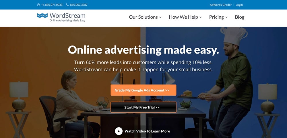
Wordstream is a keyword and competitor research tool. They have a set of tools which can help you to boost your business.
Keyword Generator, Best Keyword Research Tools, Keyword Grouping, Google Ads Tools, Display Ads and money other AI-driven tools can help you do better research for your business and run profitable ads.
Their “Grade My Google Ads Account” is a perfect example of a convincing CTA. Anyone visiting their site is a person who is having problem with their Google Ads account or they are not able to find the right keywords for their business.
This CTA is a perfect bang on.
9. GreenGeeks – Get Started Now

GreenGeeks is one of the most affordable hosting for the newbies.
They have SSD servers, free SSL, free domain and many other awesome services which makes it one of the best hostings.
They have a very clear CTA to motivate buyers to take action. CTA “Get Started Now” is a very convincing button which is suggesting the buyer to take action now.
10. ViralTag: Try for Free

ViralTag is one of the most popular social media scheduling tools that help businesses, bloggers and marketers schedule posts on various social media platforms like Instagram, Facebook, Twitter, Pinterest etc.
They have a simple and visually appealing CTA with the keyword ‘Free’. Words like ‘free’ not just attract the audience’s attention but make them try your product because there’s nothing to lose.
ViralTag has two CTAs at the top and one below the fold. With their logo of the same colour scheme, it makes their branding more understandable to their audience.
With a distinct hot pink CTA and the promise of something free, ViralTag gives the user enough reasons to click the button and try their services. Ultimately, it increases CTR.
11. SendLoop: Let’s Talk

As an email marketing service, Sendloop stands distinguishable when it comes to its CTA. It has an attractive website design and two clear calls to action buttons above the fold. While the first one is mundane the second one is what grabs the user’s attention.
‘Let’s talk’ is not just creative but emotionally compelling to people, which is why visitors would like to click on it and have a conversation regarding the services. It is just on point and displays perfection in all senses.
12. Stencil: Start Creating Images

Most companies like to have one good CTA that increases the chances of CTR. The brand Stencil which is a tool for creating social media images is no alien to this magic.
They have a great website design and content on their CTA that pushes the user to take action. Moreover, their CTA is not general but personalized to their services. The colour scheme goes well with the CTA making it clickable.
13. EPIC: Start a New Project With Us

The digital agency at EPIC has one of the most amazing calls to action buttons. It strikes the visitor’s heart with the right message and showcases them their work.
As soon as the visitor lands on their homepage, they are greeted with plenty of beautiful work that the brand’s done for other companies.
This helps make the user’s mind to click and explore more, and the wonderful CTA just acts as a cheery to the cake.
14. Filmstro – Browse Music

Filmtro is a copyright free music platform. If you are a video content creator, Flimtro is the right platform for you.
Talking about the CTA button, their “Browse Music” is a perfect call to action for music lovers. Because that’s what we do when we listen to the music. We browse through many videos or audio files and finally select the best music for us.
Browse Music is a perfect CTA for such brands.
15. Click Funnels – Start Free 14 Days Trial Now

ClickFunnels is a great tool to create sales funnels.
Landing pages, squeeze pages, eCommerce, quiz pages and almost all type of conversion-optimized pages can be created with the help of ClickFunnels.
They have a big CTA button that says “Start Free 14 Days Trial Now” but look at the description, it says “Start Building Your First Funnel Right Now.” This smart description of complementing the CTA and motivating the funnel creator to start their funnel now.
Conclusion
Little tweaks in the CTA can have a great impact on your business. One of the best practices can be, to begin with, a simple call to action and keep recording the response of your audience at every stage.
Make sure, you add words that are specific to your business and have a compelling tone. It helps your audience relate to it and makes your call to action more clickable.
Test the position, colour, size and content for your CTA and then figure out what works best for you!
Comments
Be the first to leave a comment.